News | The Modifiable Areal Unit Problem: An Overview
Stop the VideoNews

by By Efram Stone, MSCE & MPL 2017
As big data becomes increasingly important in our world, ensuring that this data is not misused becomes ever more vital. In addition to the obvious potential for deliberate misuse, there is always the risk of a naive implementation of data techniques resulting in invalid results. For most types of data, the statistical techniques required are well explored and often taught in basic statistics classes. Data with a spatial component, however, has several unique issues that are often not well understood by those working with this data. This article discusses one of these, known as the Modifiable Areal Unit Problem (MAUP), as well as why it is important, how it is open to abuse, and how it can be avoided.
What is the MAUP?
When analyzing spatial data in a Geographic information system (GIS), it is common to aggregate the data by area. The essence of the MAUP is that different aggregation schemes produce different results. This happens because data is not uniform over space. Aggregation into regions can thus lump together areas having very different characteristics, or split apart areas that share similar characteristics. The two main characteristics that can affect this are region size and region shape. Region shape is important due to the splitting and merging effects described above. Region size is important both due to those effects and due to averaging. This means that extreme values are often less common if the aggregation regions are bigger, because extreme values are averaged with lower values. This effect can smooth out important data points, giving a false impression of homogeneity. This is illustrated in the maps below, which illustrate the percentage of the population under the age of 5 in Alabama:
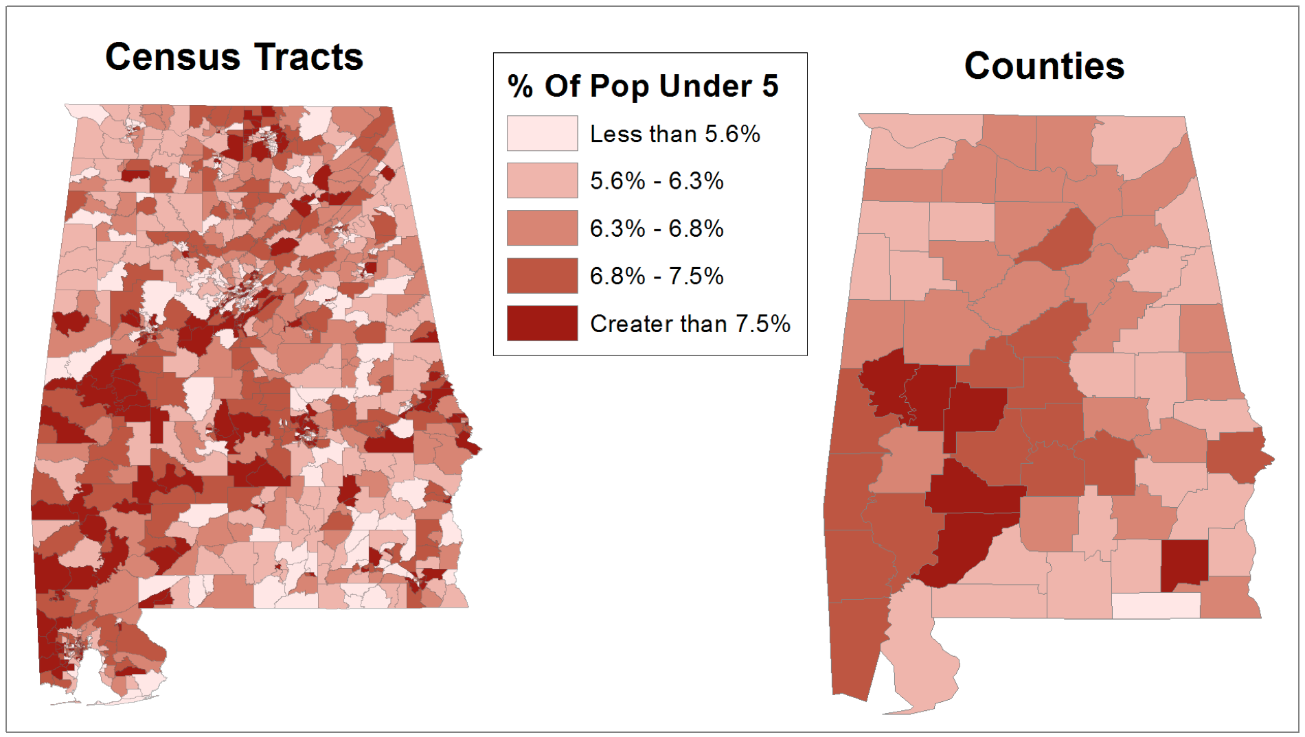
Figure 1: The effect of aggregation area size
The map on the left uses census tracts as the aggregation area, while the map on the right uses counties. Averaging’s tendency to obscure extreme values is in full evidence here, as can be seen from this table:
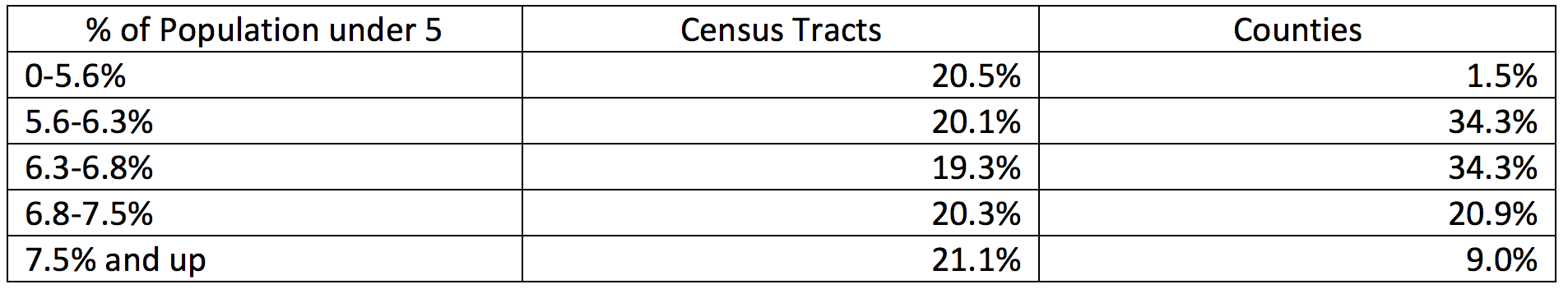
Figure 2: The effect of aggregation size on category distribution.
The symbolization intervals are rounded from quintiles based on census tracts, so the fact that data is split so evenly is not a surprise. What may perhaps be a surprise is the fact that the top and bottom groups are so denuded by aggregation (the bottom category contains one item when it should contain around 13-14). This is due to the averaging effect mentioned above, and is something which should always be considered when dealing with data containing extreme values. As for the “splitting” effect, we can see several places (such as the central part of the north edge of the state) where a high concentration of extreme census tracts is broken up among multiple counties. The map below shows area effects.
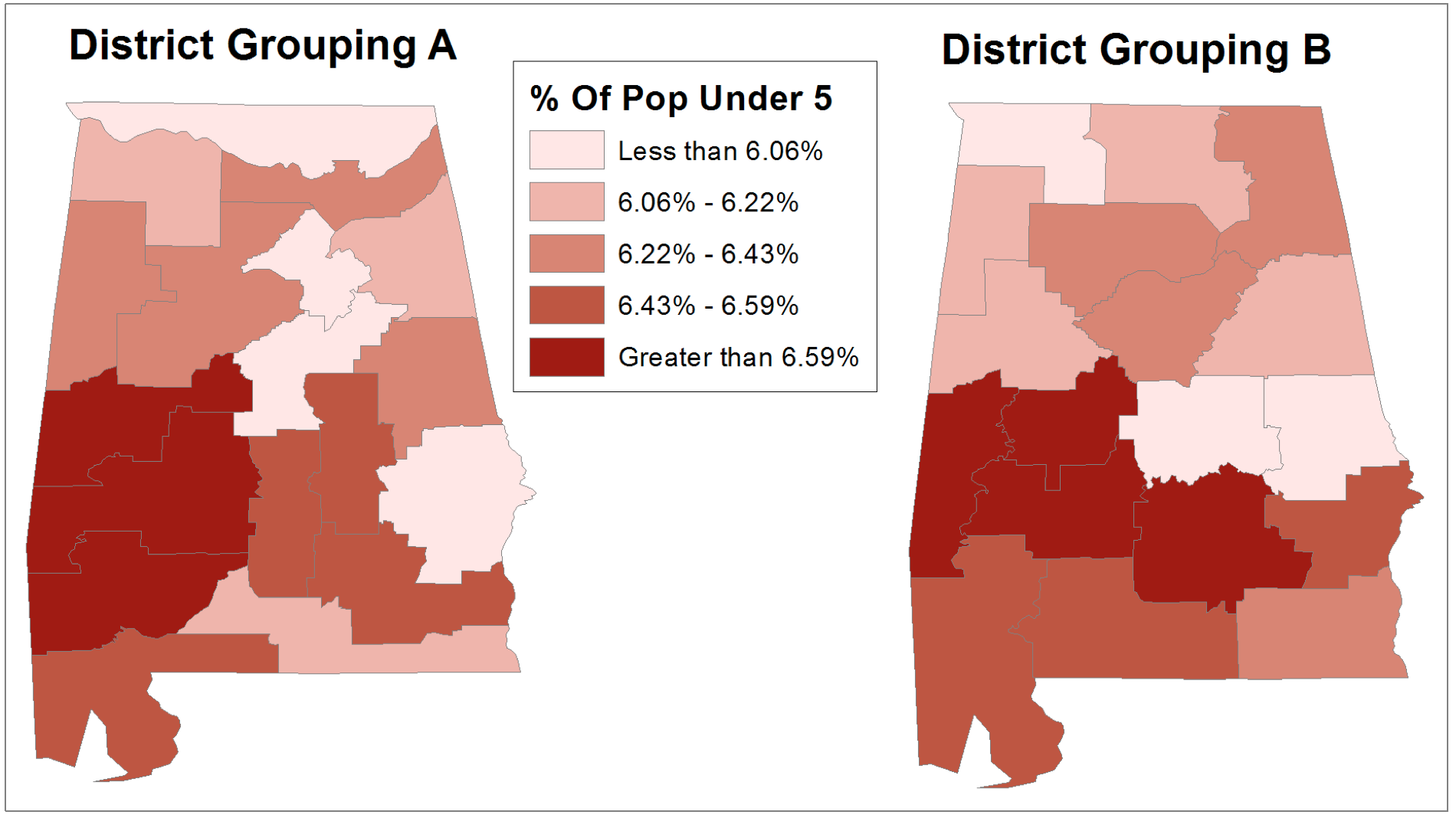
Figure 3: The effect of aggregation area shape.
This map uses different groupings of multiple counties as the aggregation districts. Although the number of districts in each group is similar (always 3 or 4) no matter which set of districts we use, some counties change groups drastically due to being aggregated into different districts. The most extreme example is the easternmost county (Russell County), which is in the lowest category using grouping A and the second-most category using grouping B. This is because the two counties to the north of it have a lower percentage of people over 5, and effect any group that they are included in. The easternmost county (Jackson) has a similar problem, and jumps from the lowest category to the middle one depending on whether grouping A or B is used.
What Happens if the MAUP is abused?
The primary consequence of the MAUP occurs when we care about the number of districts that occur in each group. The classic example of this is gerrymandering, which is the practice of rewriting political boundaries to serve the interests of politicians and political parties. Voting blocs in different areas who are likely to vote for a specific politician or party are typically connected into the same district using narrow connections, and the same area is often split among different districts to minimize its influence. In effect, votes are being aggregated in creative ways to achieve the desired number of seats in Congress and ensure that they are “safe”. This hints towards one of the larger issues raised by the MAUP: an unscrupulous analyst can “play” with the aggregations to achieve the desired results. Of course, it is entirely possible for the same thing to happen by accident. If an analyst is unaware of the MAUP, and picks aggregation districts arbitrarily, the districts may conceal existing patterns, or show patterns that are not really there. This is especially of concern due to the prevalence of choropleth maps, which divide an area into a number of districts colored according to which group they fall into (such as in the maps of Alabama above). If the data is not already sorted by area, aggregation is necessary to make a choropleth map. As such, you will need to be very careful to account for the MAUP when creating and reading choropleth maps. Details are given below.
How can the MAUP be dealt with?
When performing an analysis that involves aggregation, we must be careful to account for the MAUP. The simplest cases are those where there is some aggregation scheme that directly relates to the problem (such as states when presenting voting results during a presidential election). In those cases, the MAUP generally does not apply. However, when you have to come up with your own aggregation scheme, there are several principles that can be used. Firstly, and most importantly, we should aggregate on a scale smaller than or the same as the one on which the data varies. This keeps averaging from being an issue, because we keep the aggregation regions too small much variation. Additionally, we should keep aggregation regions compact and physically similar, to avoid issues such as gerrymandering. We should also make sure to perform sanity checks (such as ensuring that urban and rural areas are not being merged with each other, and checking to see if there are other aggregation schemes that massively change the results). We should also check for similar errors when checking other people’s analysis. If we do these things, we should generally be able to deal with the MAUP.
Sources:
Ingraham, Christopher. “How to Steal an Election: A Visual Guide.” The Washington Post 1 Mar. 2015
Monmonier, Mark. “Data Maps: Making Nonsense of the Census.” How To Lie With Maps. Chicago: University Of Chicago Press, 1996. 139–162. Print.
Biography:
Efram Stone is a dual Masters student in the Transportation Engineering and Transportation Planning programs at the University of Southern California who is also working on a GIS Certificate there. Efram’s interest in transportation began at a young age when he attended elementary school next to a major infrastructure project, and has continued unabated since. Efram plans to graduate in May, 2017. He can be reached at [email protected].
News Archive
- December (1)
- November (6)
- October (4)
- September (2)
- August (3)
- July (4)
- June (3)
- May (7)
- April (8)
- March (11)
- February (8)
- January (7)
- December (7)
- November (8)
- October (11)
- September (11)
- August (4)
- July (10)
- June (9)
- May (2)
- April (12)
- March (8)
- February (7)
- January (11)
- December (11)
- November (5)
- October (16)
- September (7)
- August (5)
- July (13)
- June (5)
- May (5)
- April (7)
- March (5)
- February (3)
- January (4)
- December (4)
- November (5)
- October (5)
- September (4)
- August (4)
- July (6)
- June (8)
- May (4)
- April (6)
- March (6)
- February (7)
- January (7)
- December (8)
- November (8)
- October (8)
- September (15)
- August (5)
- July (6)
- June (7)
- May (5)
- April (8)
- March (7)
- February (10)
- January (12)
2024
2023
2022
2021
2020
2019
2018
2017
2016
2015
2014
2013
2012
2011
2010
Major Funders


Metrans Associate Partners